Two Letters,
One Line
- Role & scope
- Brand Identity
Logo & Graphic Design - Client
- Reylan Ocampo, personal brand
- Deliverables
- Logo system, colour, type, applications
Overview
I needed a mark that works as hard as the websites I build. Simple enough for a favicon, confident enough for a business card, and recognisably mine.
The goal
Build a small, flexible identity that feels modern and trustworthy, and stays consistent everywhere my work shows up.
A clear, memorable signature across the website, proposals, social media and print, so clients remember who made their site.
A calm, professional look that tells small business owners they’re in steady hands before we even talk.
Process
How the identity came together
I treated my own brand like a client project: one idea for the mark, a short set of rules, and real places to test it.
-
01
The mark
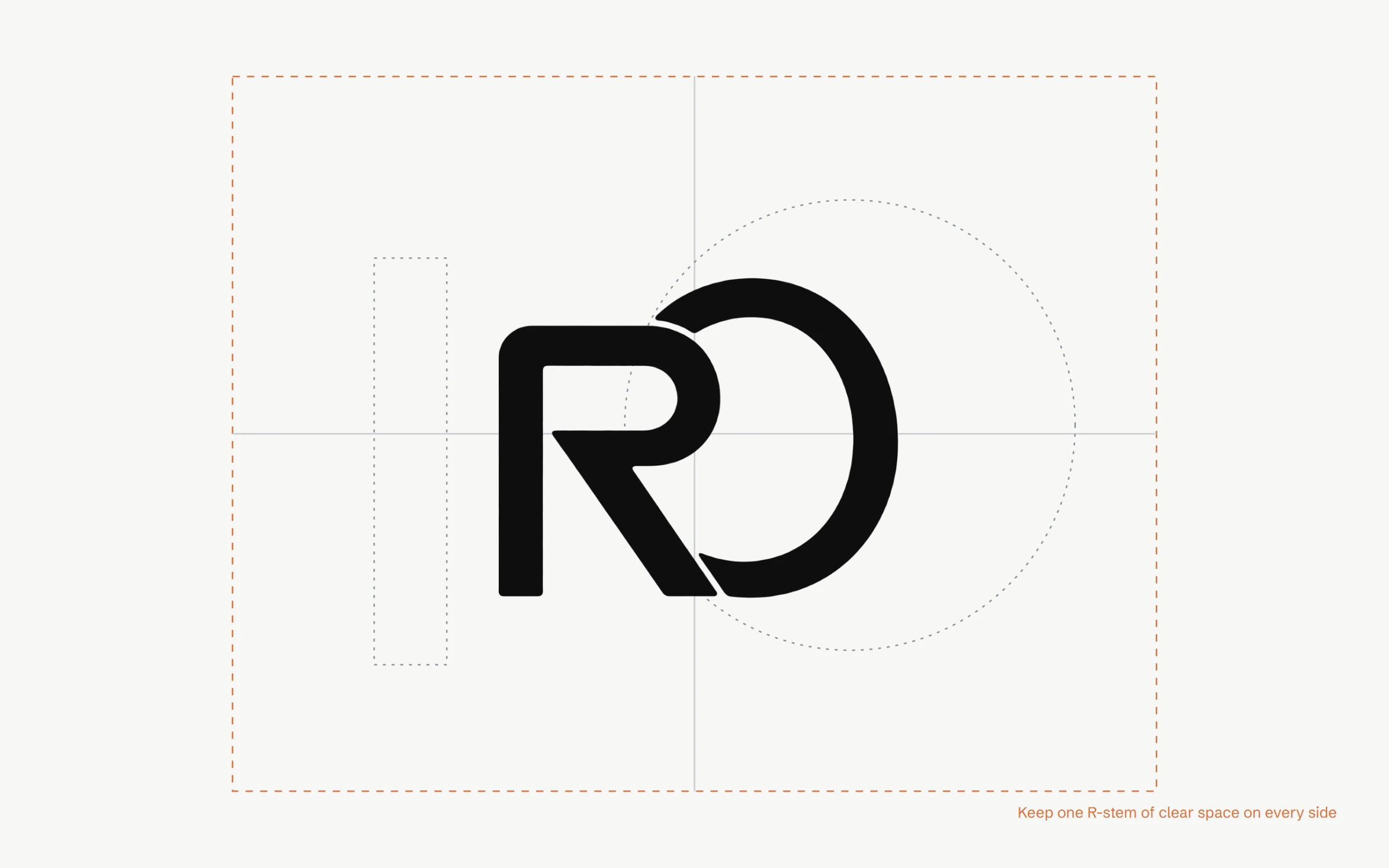
The logo joins my initials, R and O. The leg of the R sweeps straight into an open O, so the two letters read as a single stroke, the same way design and development happen in one place when you work with me. The O is left open so the mark feels approachable rather than closed off.
Construction
-
02
Logo system
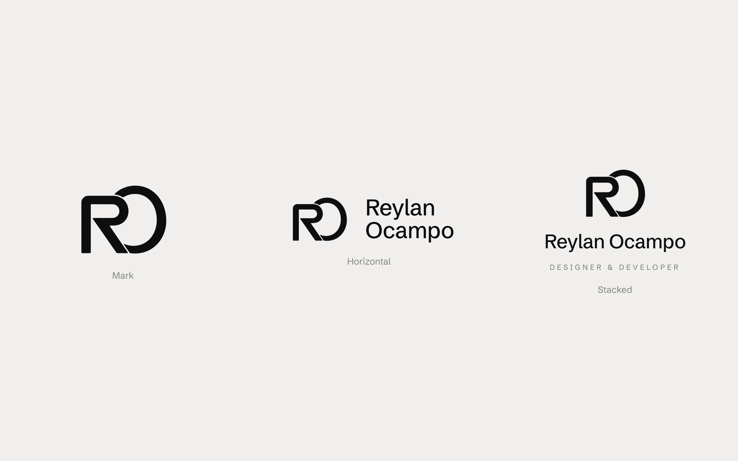
One mark isn’t enough for every space. I set three lockups: the mark on its own for small sizes like the favicon and profile picture, a horizontal version for headers, and a stacked version for covers and presentations.
Lockups
-
03
Colour & type
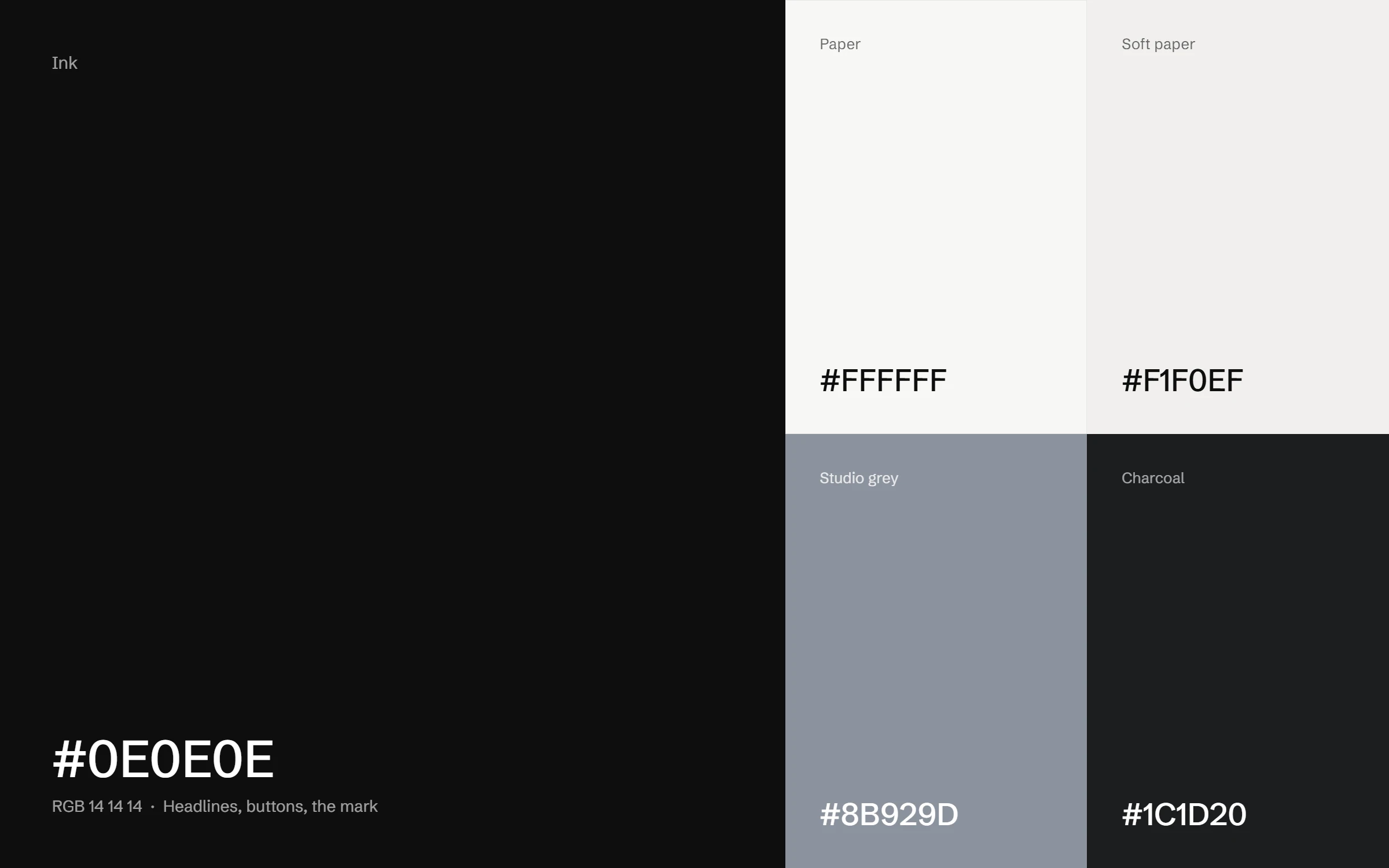
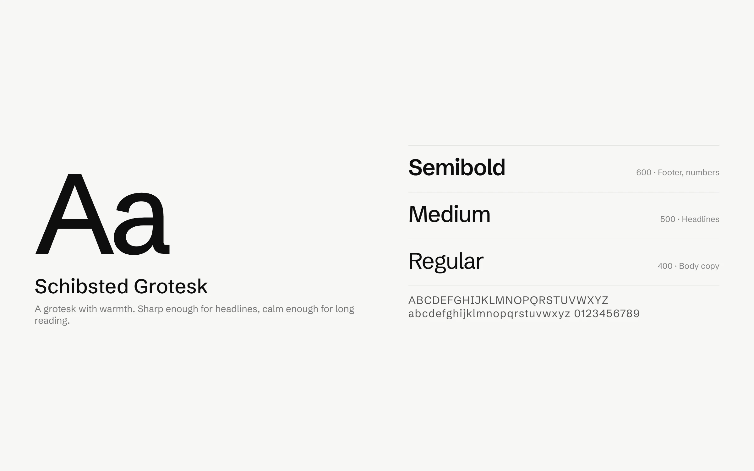
The palette is mostly ink and paper, so the work I show always stays the loudest thing on the page. A studio grey, taken from my portrait backdrop, and a charcoal add depth without adding noise. Schibsted Grotesk carries every headline and paragraph, with three weights and nothing more.
Colour palette
Typography
-
04
Graphic elements
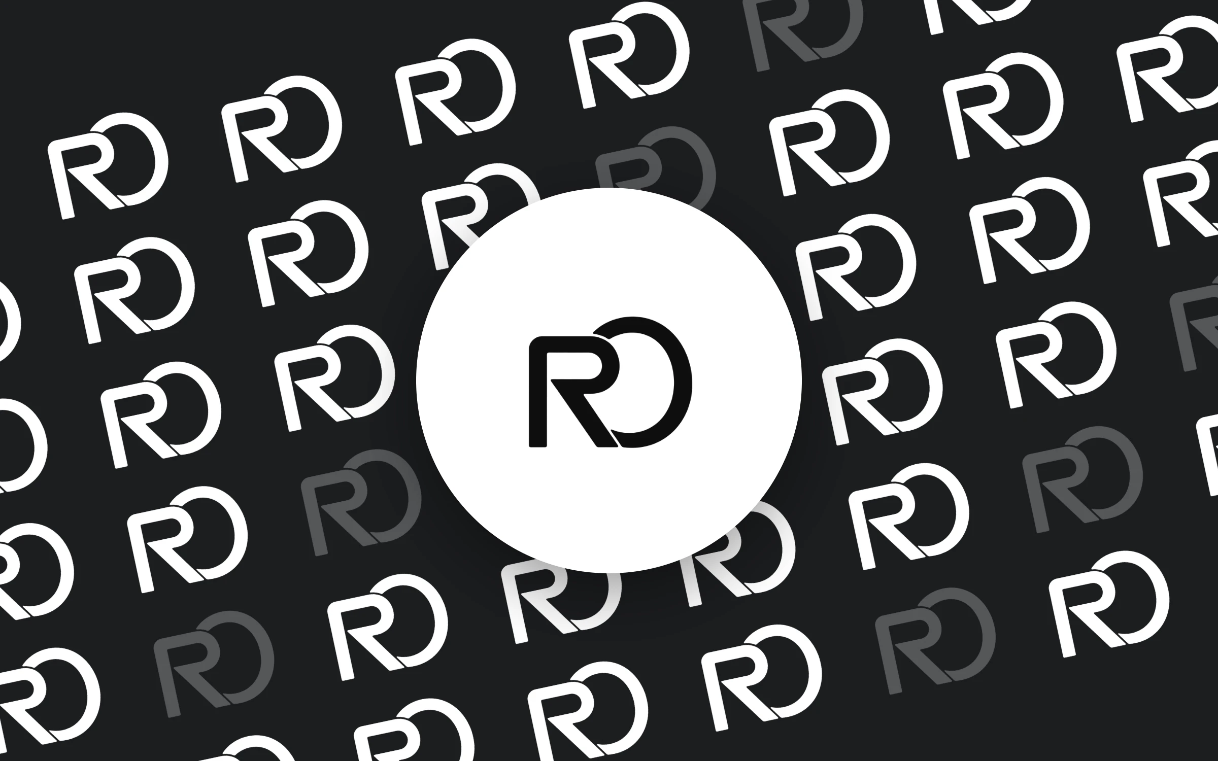
Repeating the mark at an angle creates a pattern for backgrounds, packaging and social covers. A few marks are dimmed so the pattern has rhythm instead of reading as a flat wallpaper.
-
05
Applications
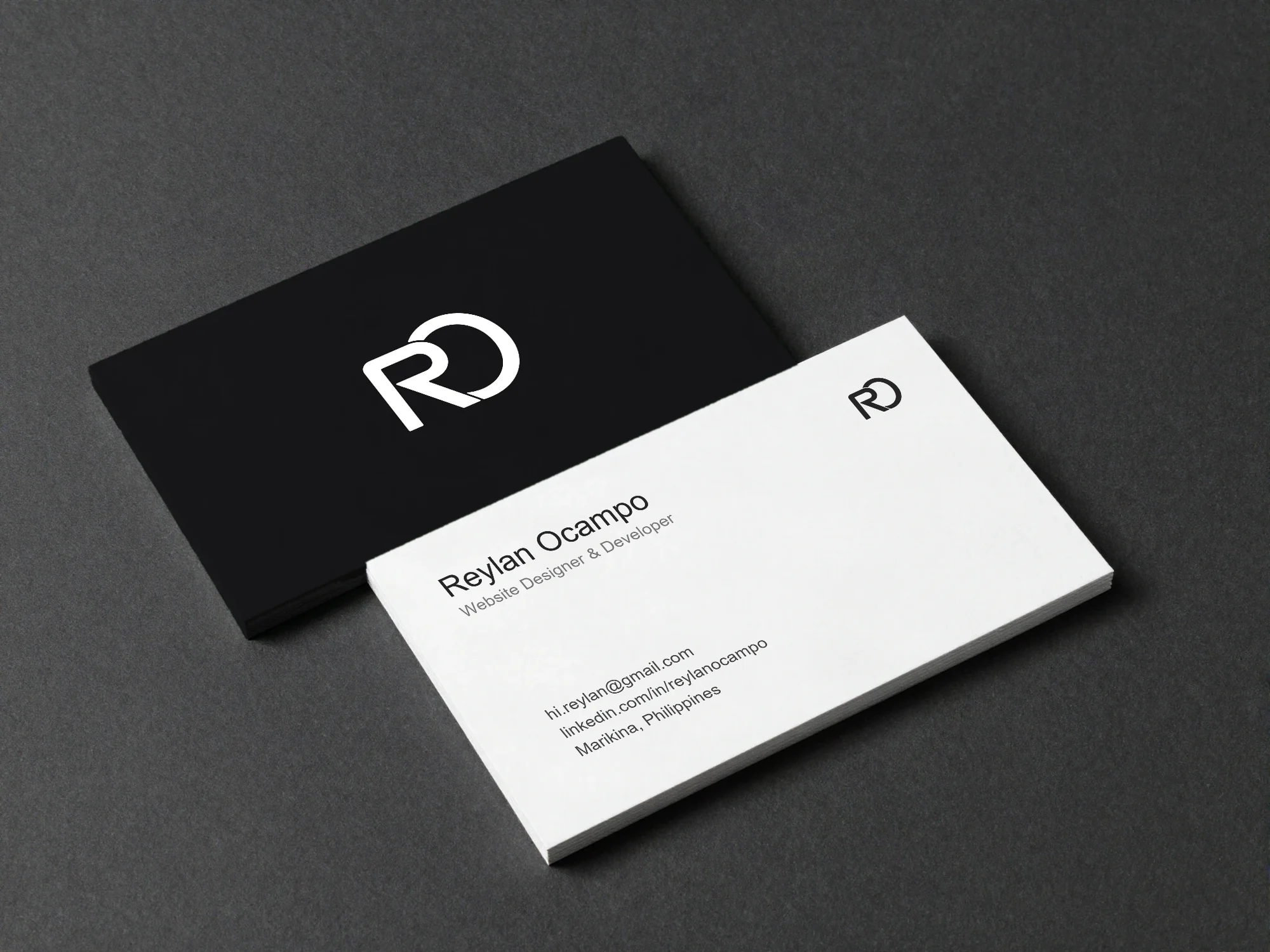
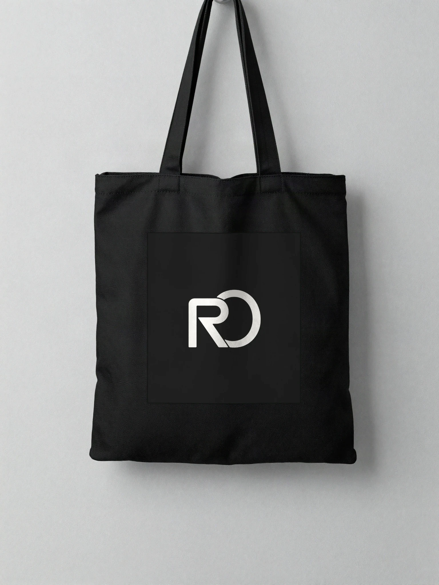
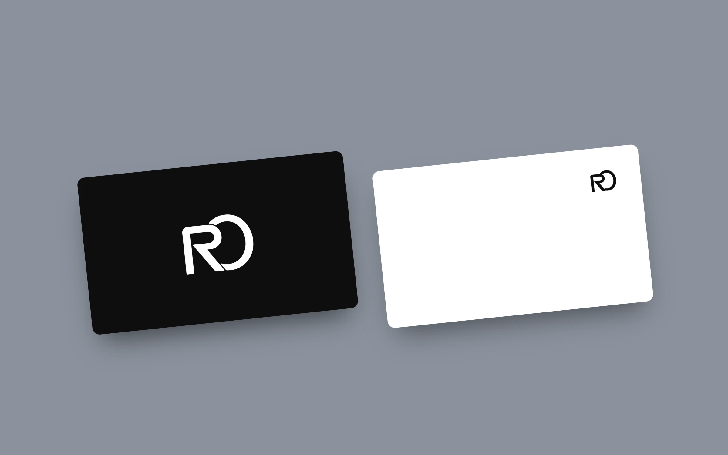
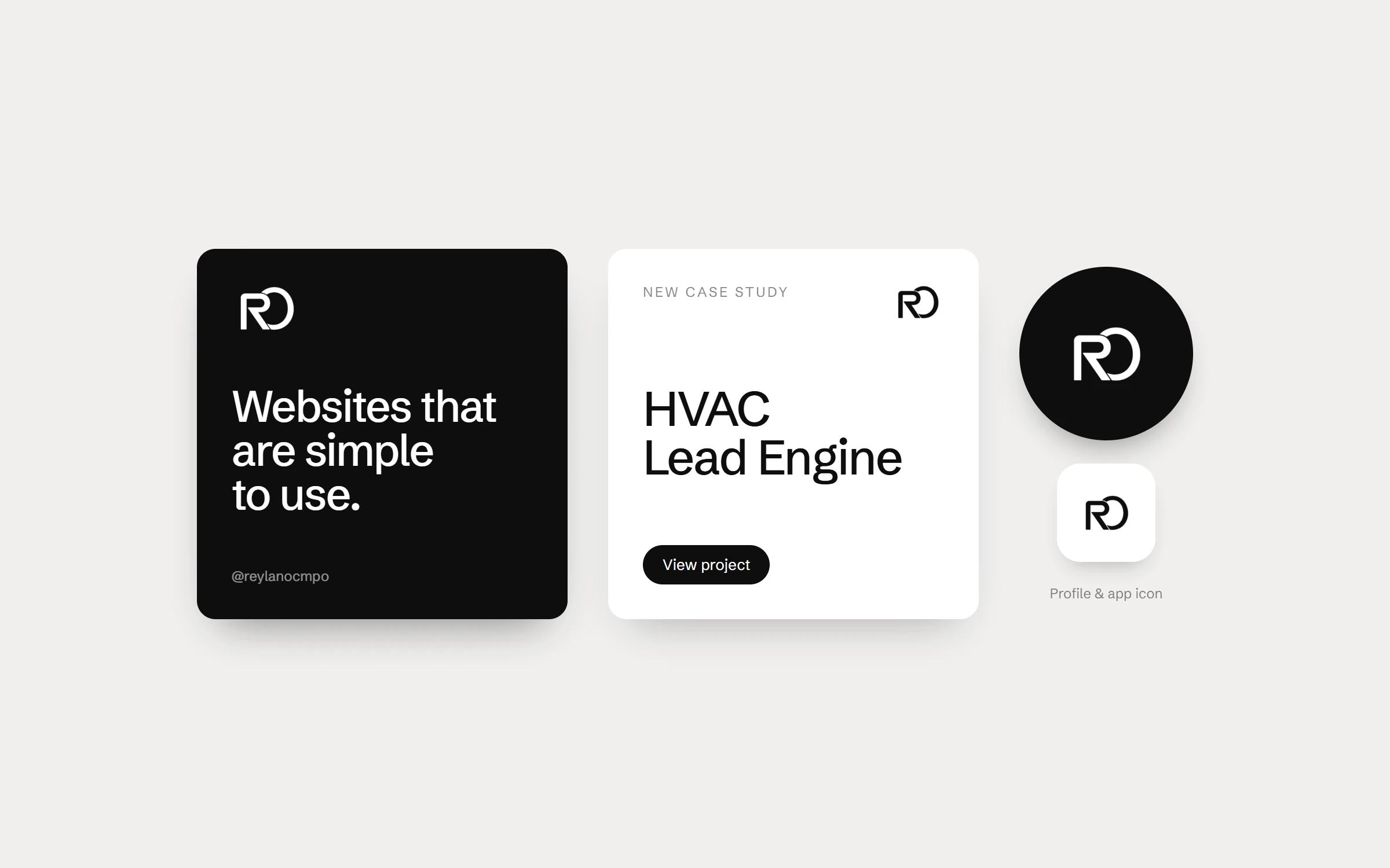
I tested the identity where it actually lives: printed business cards, social posts, profile pictures and the navigation of this website. If the mark still reads at 32 pixels and on a card across the table, it works.
Print
Social & digital
Results & Reflections
The RO mark now signs everything I make. From the corner of this website to the front of a business card.
What worked
Keeping the system small. One mark, three lockups, five colours and one typeface make it easy to stay consistent on every page and post.
What I learned
Designing for yourself is the hardest brief. Treating it like a client project, with clear goals and real tests, is what finally got it done.