Booking Made Easy
- Role & scope
- UX Designer & Website Designer
- Client
- Brody Pennell Heating & Air Conditioning
- Year
- 2025
Overview
Brody Pennell has kept Los Angeles comfortable since 1945. The website needed to show that trust in seconds and make booking a service effortless.
The goal
Design a website that helps Brody Pennell grow and makes getting help easy for the homeowners who need it.
Turn more visits into calls and service requests, and show the trust the company has earned over 80 years.
Find the right help quickly, feel confident choosing Brody Pennell, and book without friction.
Process
How the site came together
I handled the UX and the website design. Each step fed the next, so every screen traces back to something a homeowner needed.
-
01
Research
I started by learning how the business works: the services it offers, how new jobs come in and where its pain points are. Then I looked at the customer side, what homeowners need, what they want and what they look for when they search for heating and air conditioning help.
Research & Competitor analysis
Other LA HVAC sites share the same problems
Before designing, I reviewed three HVAC companies competing for the same Los Angeles homeowners. All three offer solid service, but their websites make the next step harder than it should be.
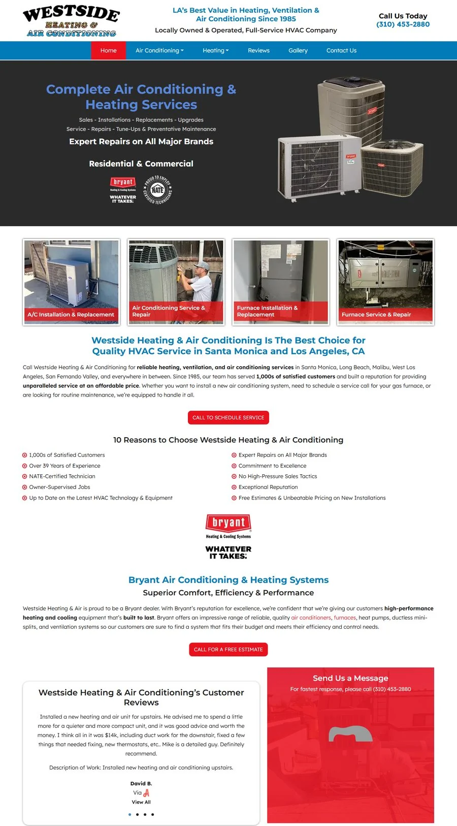 134
134Westside Heating & AirHero with no button, long paragraphs, reviews far down the page. 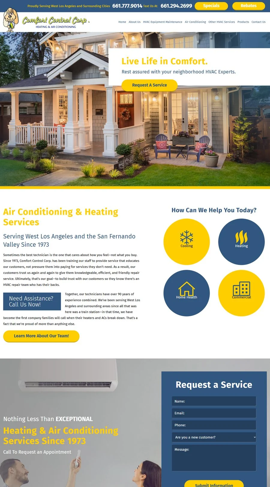 235
235Comfort Control Corp.Two phone numbers up top, history-heavy copy, a five-field form. 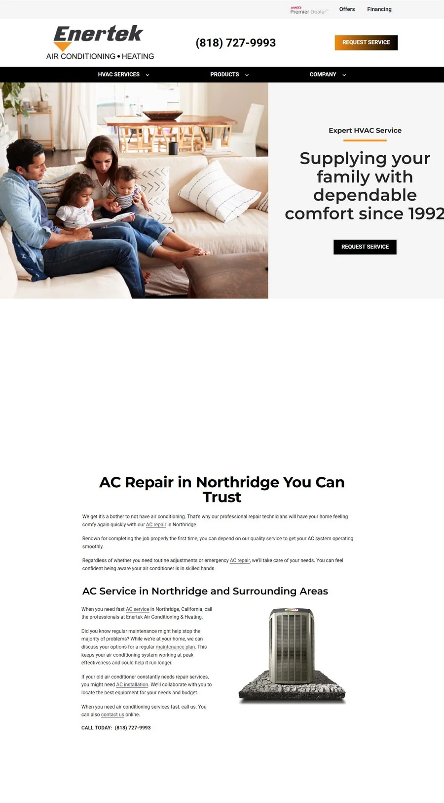 34
34Enertek Air ConditioningClean hero, then small-print service text and no reviews near the top.
Desktop homepages, captured September 2026
- 1No clear action in the heroWestside opens with services and brand logos but no button, so visitors have to scroll to find out how to book.
- 2Mixed contact optionsComfort Control shows a call number and a separate text number side by side, which makes people stop and choose.
- 3Walls of textAll three lean on long paragraphs about history and service areas, which pushes services and proof further down.
- 4Reviews hard to findWestside’s reviews sit most of the way down the homepage, and Enertek shows none near the top.
- 5Forms that ask a lotComfort Control’s request form has five inputs, including whether you’re a new customer, before anyone can hit submit.
The numbered markers on the three screenshots show where each problem appears. Numbers 1 to 5 match the list above.
These five patterns became the checklist for Brody Pennell. Every section of the new site had to avoid at least one of them.
-
02
Structure
With the competitor analysis, customer pain points and research into the HVAC industry in hand, I mapped out the site’s structure. That gave me a clear picture of what needed to be built before any design work began.
Information architecture
Built around the homeowner’s questions
The competitor sites made people dig for answers. I mapped the questions a homeowner asks on the way to booking, then gave each one a clear answer in the order they ask it. The numbers show which competitor problem each stage avoids.
- 1Arrive
Can I reach someone fast?
Phone number and Request Service sit in the header on every page.
Avoids 12 - 2Trust
Is this company any good?
Google, Facebook and Yelp ratings above the headline, awards right below.
Avoids 4 - 3Find
Do they fix my problem?
Air Conditioning and Heating, each split into repair, maintenance and installation.
Avoids 3 - 4Act
How do I book?
Three clear ways in, depending on how urgent it is.
Avoids 15
Call nowUrgent repairBook onlinePick a timeRequest ServiceFour-field formService bookedUser journey
Sitemap
The sitemap follows the same logic. Services come first in the navigation, trust content lives on About Us, and every page leads to one Request Service form.
Wireframes
Low-fidelity wireframes for desktop and mobile
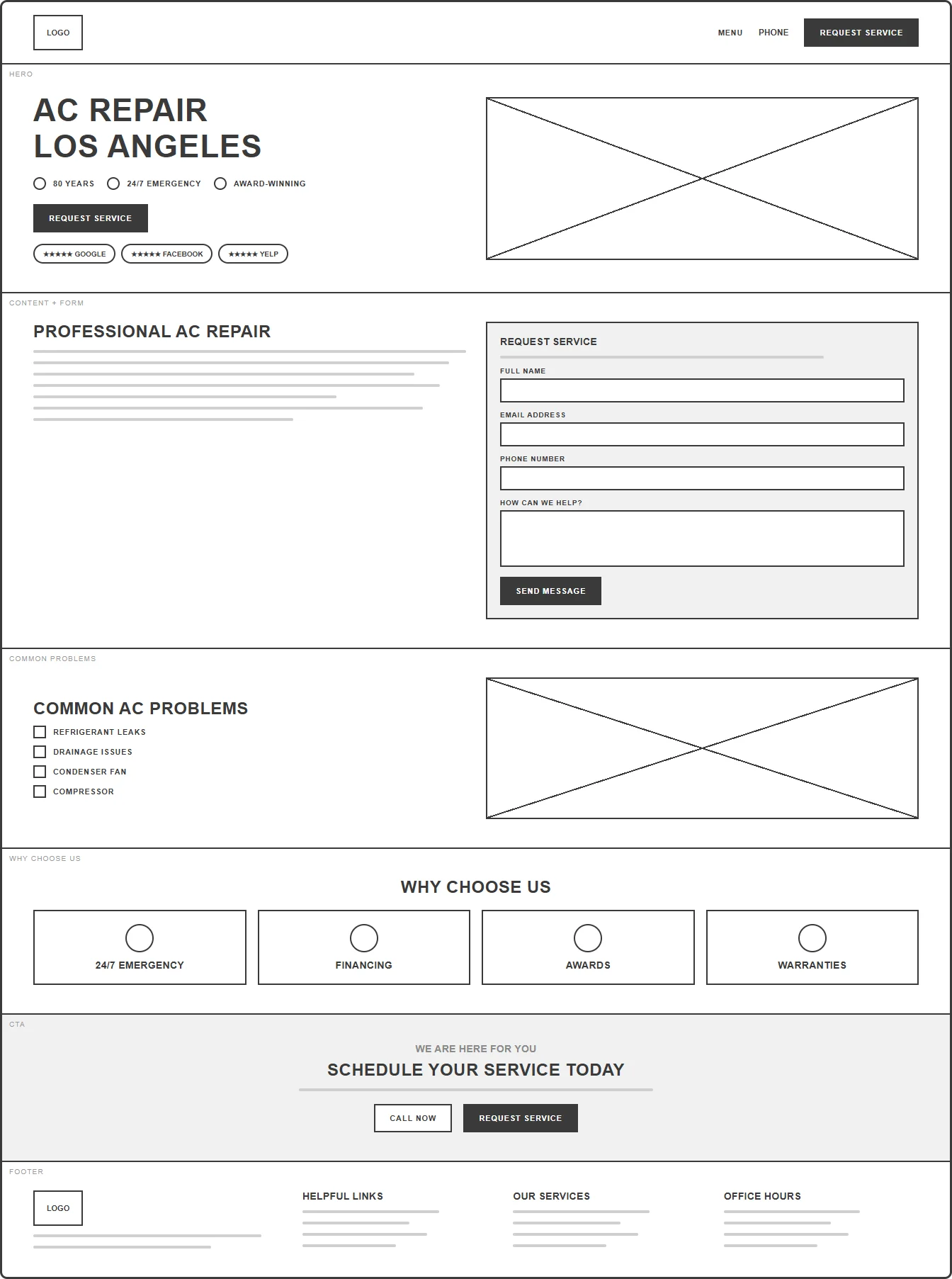
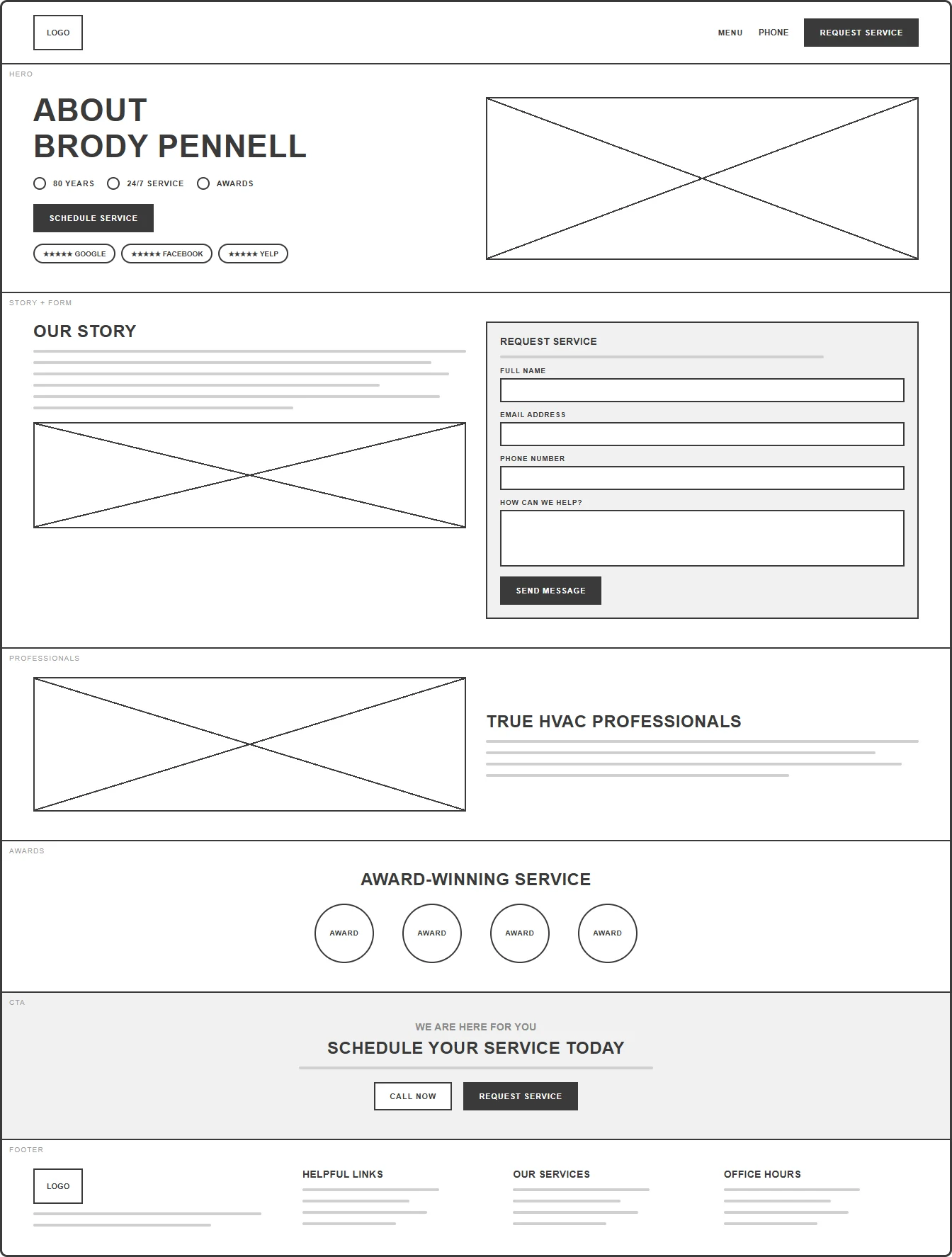
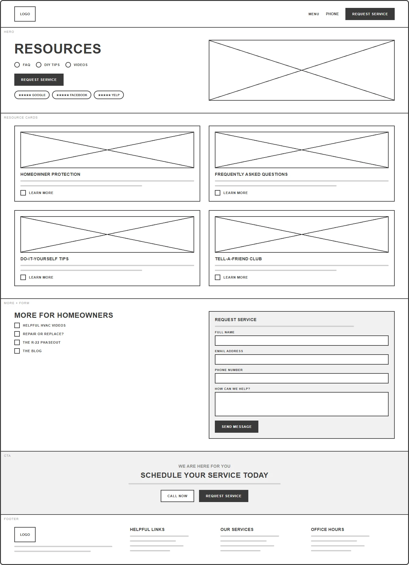
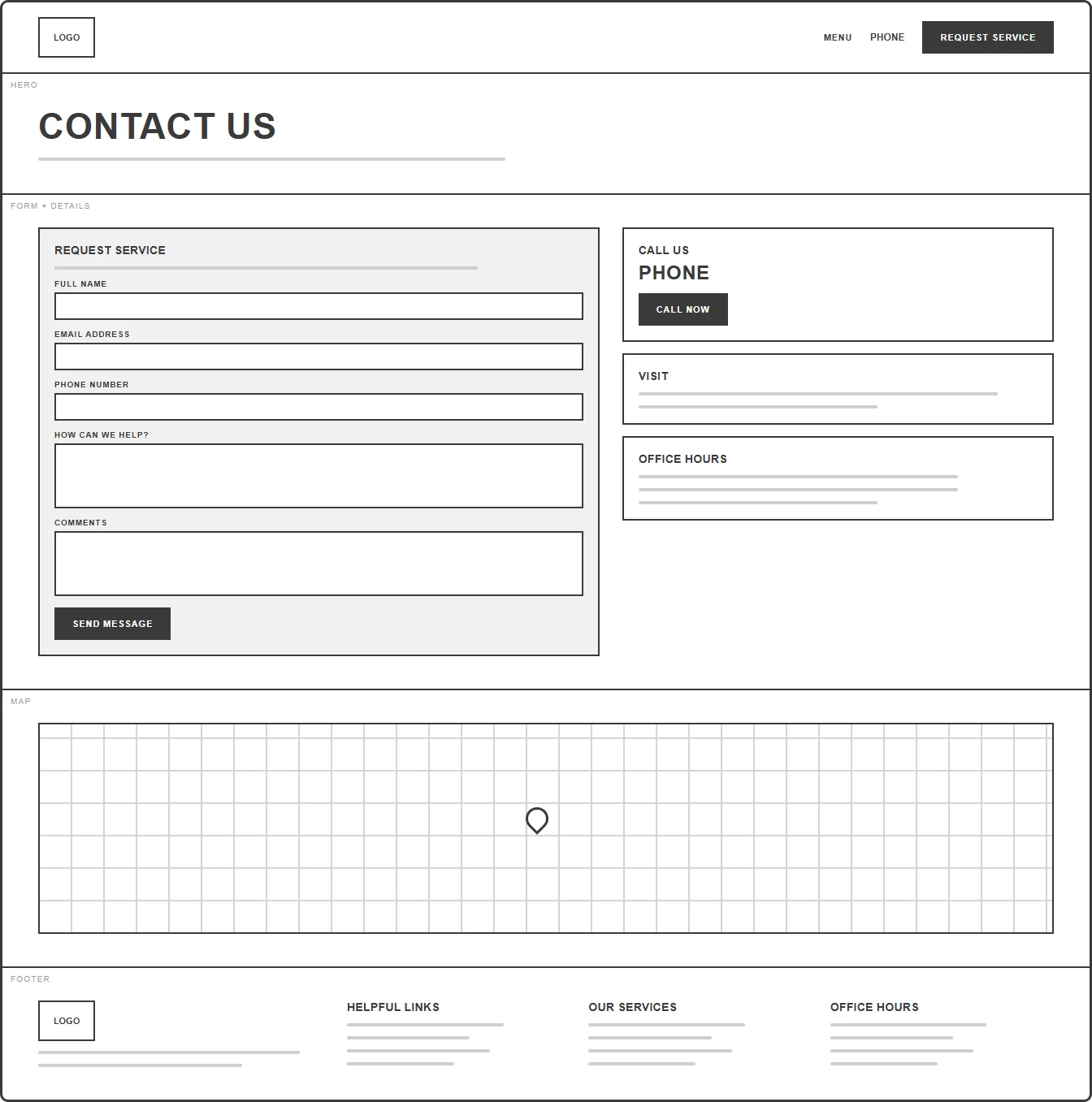
Before picking colours, I sketched every page in the sitemap as a low-fidelity wireframe: the homepage, one service template shared by every air conditioning, heating and air quality page, About Us, Resources and Contact. Plain boxes and lines kept the focus on content order, where the Request Service form sits and how quickly someone can act.
Homebrodypennell.com
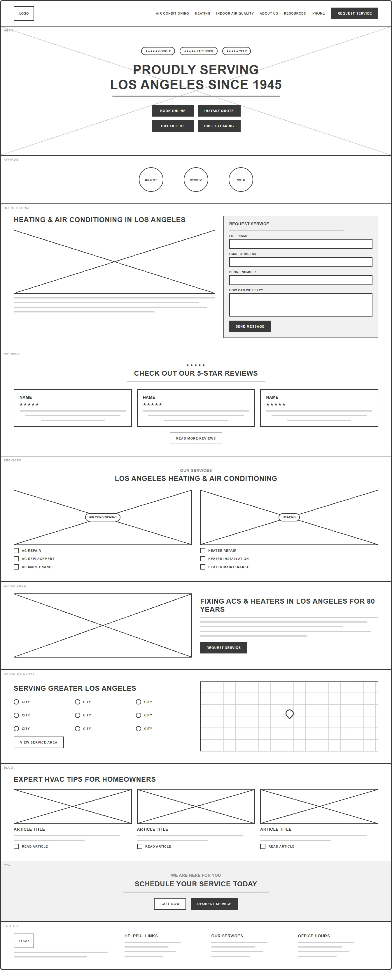
Service pageAir Conditioning › AC Repair
About UsAwards, licenses, testimonials
ResourcesFAQ, DIY tips, videos, blog
ContactRequest Service form
Desktop · Home, service template, About Us, Resources, Contact
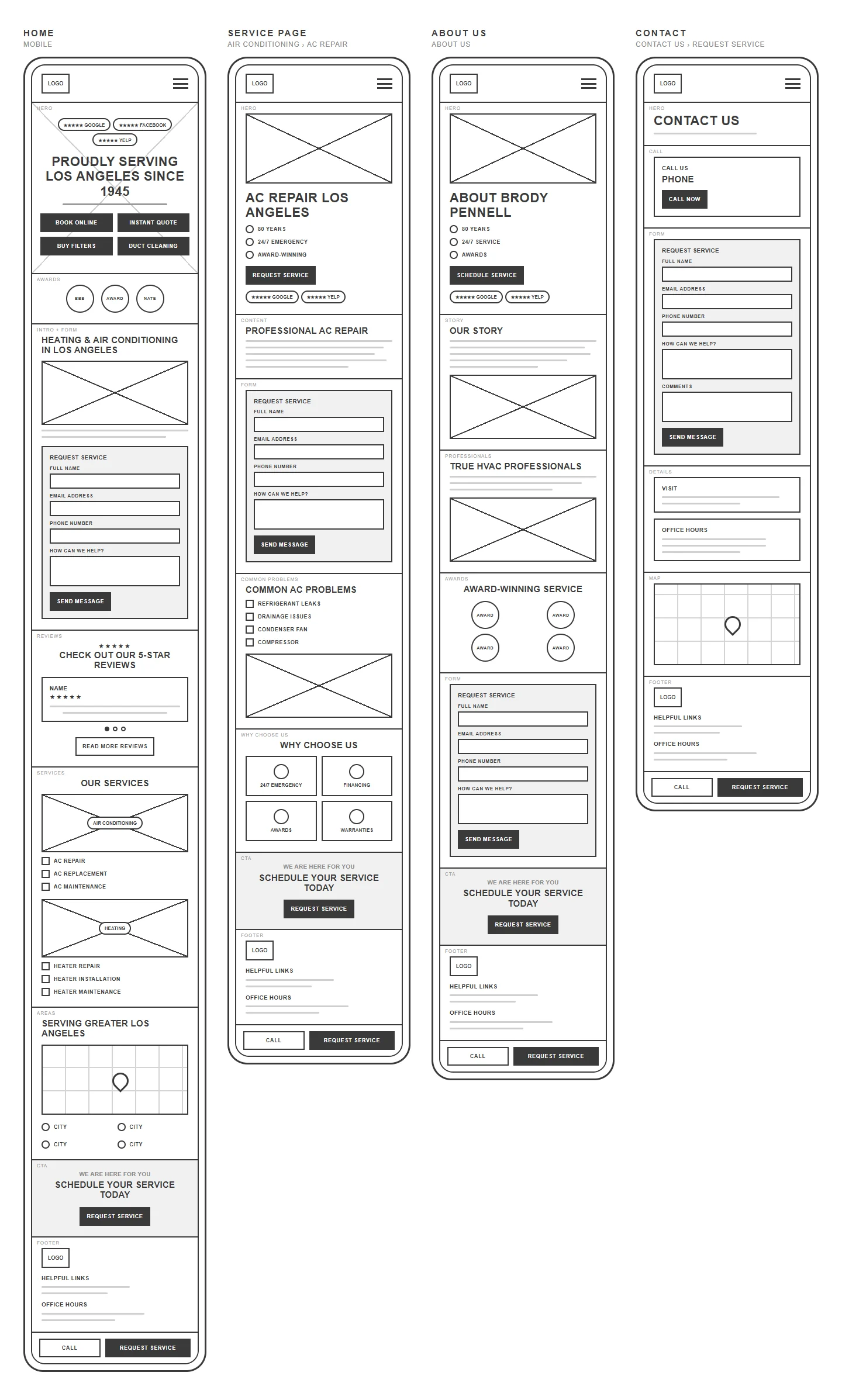
Mobile · Home, service template, About Us, Contact - 1
-
03
Visual design
I started with a moodboard built from what the company already has: the logo, navy uniforms and vans, real technicians and warm Los Angeles light. The orange and red come straight from the logo’s arc, and navy gives the white wordmark a home in the header, so the website looks like the same company people see pull into their driveway.

- Arc orange#FB8200 · buttons
- Heat red#ED1700 · accents
- Navy#172B40 · header
- Cream#EDE3D1 · sections
- White#FFFFFF · cards
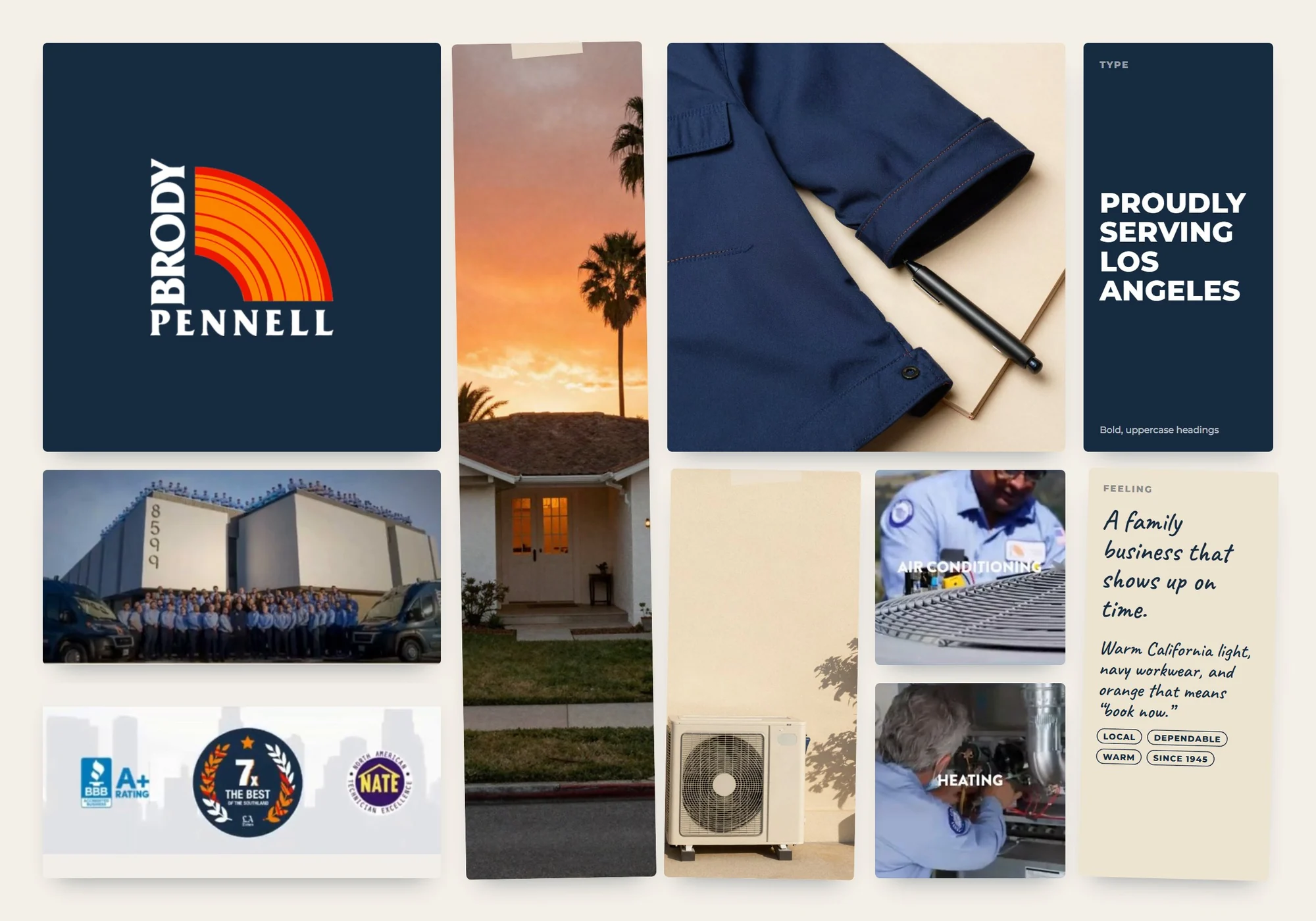
Moodboard -
04
Mockups & handoff
I placed the finished pages in real settings to check they still read clearly at a glance, then handed over the screens, colours, type styles and button states so the build could match the design.
Desktop mockups
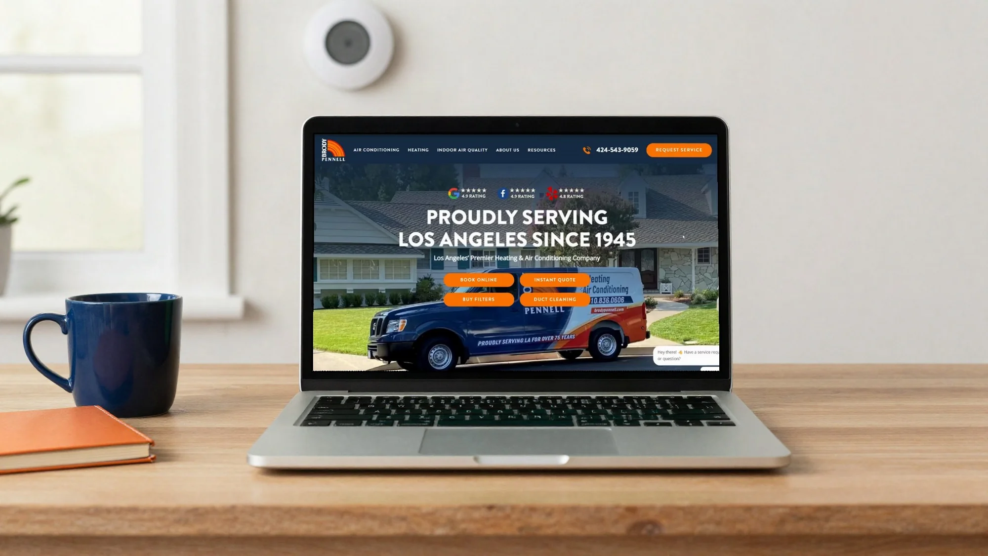
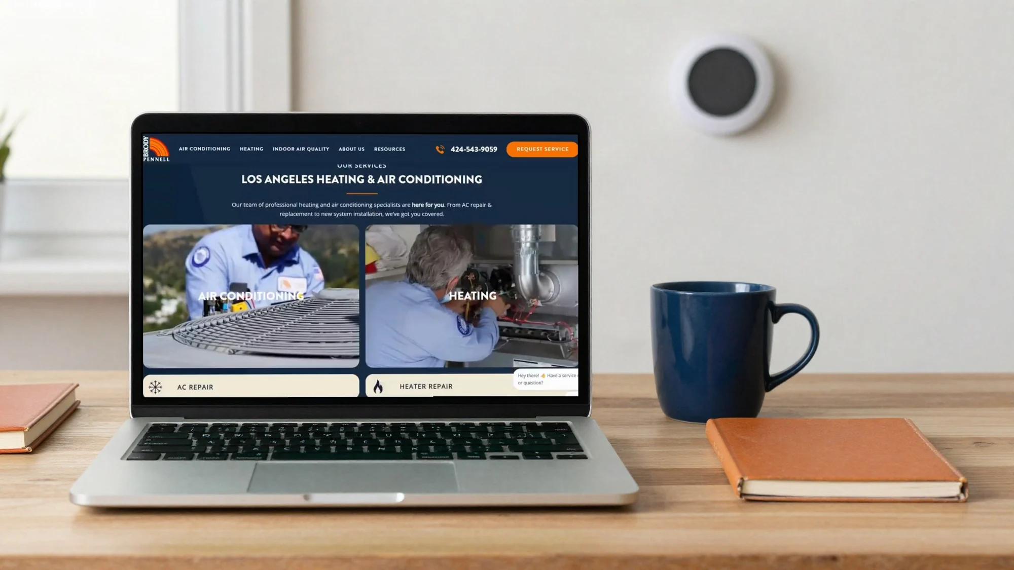
Mobile mockups
Home, services, reviews & request service on mobile

Results & Reflections
Every visitor now has a clear next step. Calling or requesting service is one tap away, on a phone or a desktop.
What worked
The design removes the guesswork. From the first screen, homeowners can see who Brody Pennell is, what they fix and exactly what to do next: call or request service.
What I learned
People with a problem want a fast solution. A clear call to action, honest visuals and real social proof on the website give them the confidence to contact the business and book right away.