A Store Worth
the Pour

Role & scope
Website Design
Website Development
Client
Decant-It Wine & Spirits
Project
E-commerce redesign
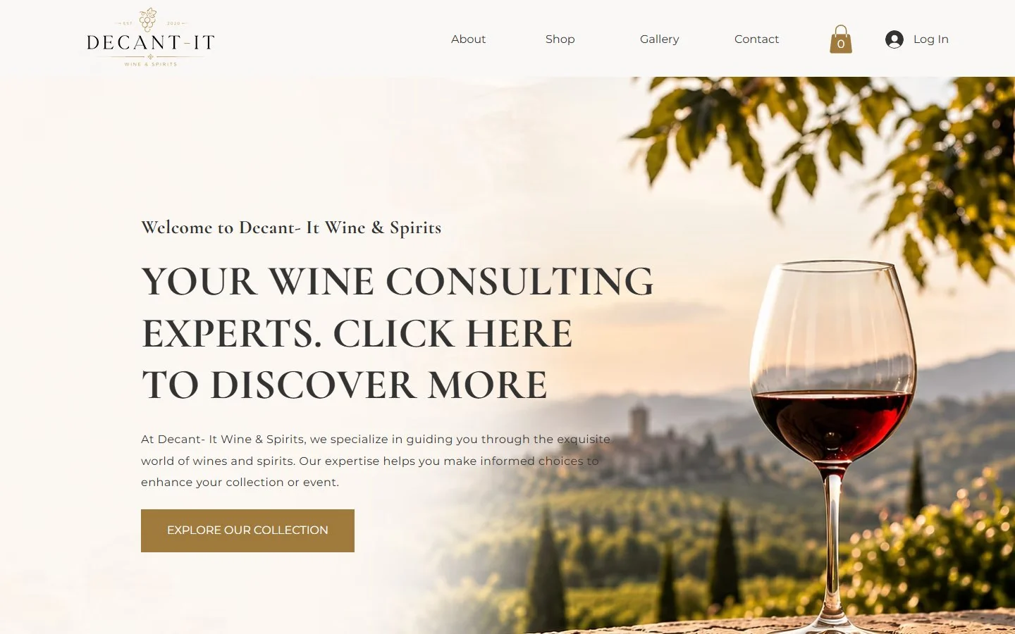
Redesigned Decant-It homepage hero: ivory background, vineyard photo with a glass of red wine and a gold Explore Our Collection button
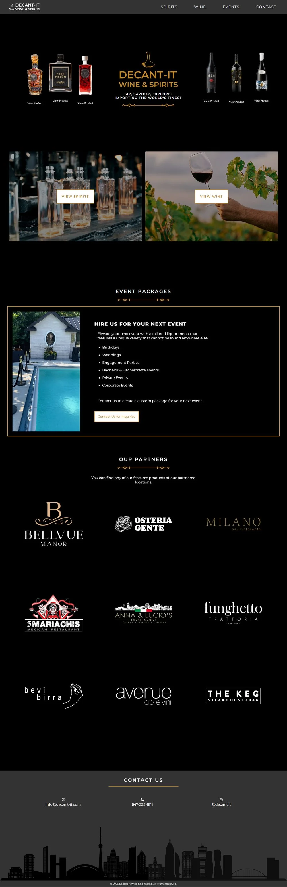
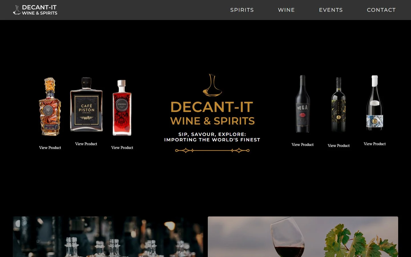
Original Decant-It homepage hero: black background with six bottles and a small centred logo
Before After

Drag to compare the old homepage with the redesign

Overview

Decant-It imports wine and spirits and builds drink menus for events. Its old website looked like a nightclub flyer, and nobody could buy a bottle from it.

The goal

Redesign the website into an online store that feels as considered as the bottles it sells.

For the business

Sell directly online, tell the story behind each brand and stand apart from the dark, generic look most liquor sites share.

For shoppers

See the bottle, the price and the story in one place, then add it to the cart without hunting.

Process

How the redesign came together

I handled the UX and the website design. I started from what the old site got wrong, then made every design decision answer one of those problems.

  1. 01

    Audit

    I went through the original site the way a shopper would, looking for a bottle to buy or a reason to trust the brand. The products were there, but the site made them hard to see and impossible to purchase.

    What wasn’t working

    A premium product on a flyer-style site

    decant-it.com
    Original Decant-It homepage with numbered problem markers
    123
    1. 1Heavy, dark lookBlack on every section made labels and bottles hard to read and set a nightlife tone instead of a curated cellar.
    2. 2No way to shopBottles only linked to “View Product”. The homepage showed no prices and no cart.
    3. 3Brand lost in the middleThe logo and tagline sat small between two rows of bottles, so nothing led the eye.
    4. 4No storyNothing explained the brands, the importing or why these bottles were worth choosing.
    5. 5Space in the wrong placesThe partner logo grid took up more of the page than the products did.
  2. 02

    Design decisions

    Each change below starts with the problem it solves. Together they move Decant-It from a dark catalogue to a warm, trustworthy store.

    A

    From black to warm ivory and gold

    Wine is bought on feeling. Ivory backgrounds and antique gold borrow the colours of oak barrels, labels and candlelight, so the site feels like a tasting room. The black stays, but only as a single band for the partner logos. Solves 1.

    Before
    • Black#100F0E
    • Charcoal#333333
    • Amber#C1892B
    After
    • Ivory#FAF8F6
    • Logo gold#A98856
    • Antique gold#A07A3C
    • Black#000000
    B

    A logo with heritage

    The old logo read like a nightclub sign. The new serif wordmark, grape cluster and Est. 2020 signal an established importer, and the gold works on light backgrounds across the site. Solves 1 and 3.

    C

    Type that feels like a wine label

    All-caps sans-serif shouted every line at the same volume. A classic serif for headings with a light sans-serif for body text gives the pages a clear order and the calm tone of a printed label. Solves 3.

    Before

    SIP, SAVOUR, EXPLORE:
    IMPORTING THE WORLD’S FINEST

    Wide sans-serif, all capitals
    After

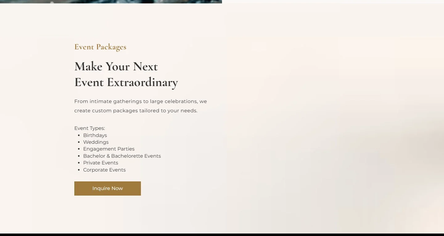
    Make Your Next
    Event Extraordinary

    From intimate gatherings to large celebrations, a menu tailored to your event.

    Classic serif headings, light sans-serif body
    D

    A shop, not a catalogue

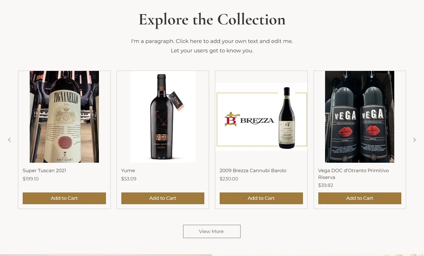
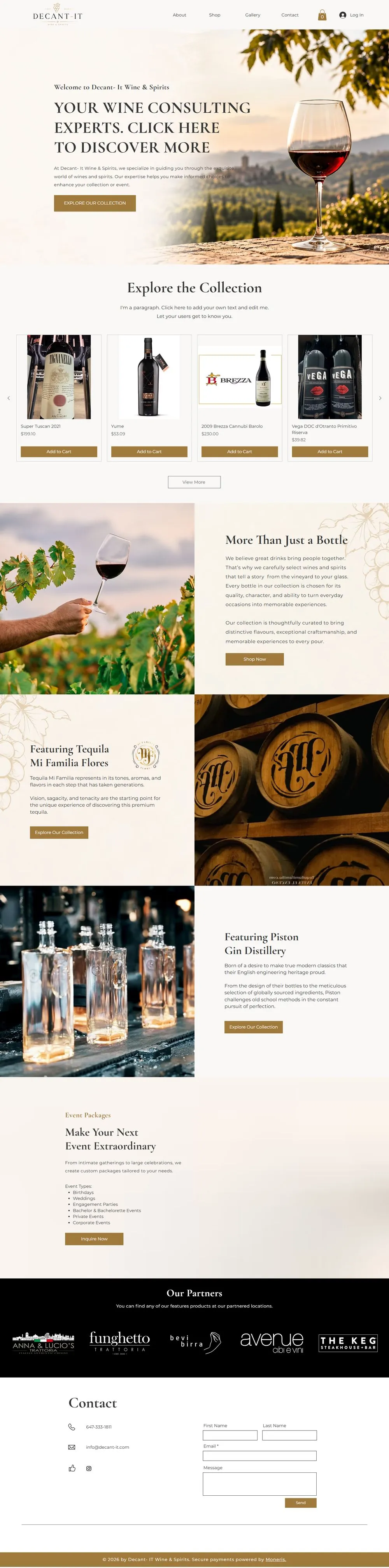
    Every featured bottle now has its name, price and an Add to Cart button, in a carousel directly under the hero. Shoppers can buy from the homepage instead of clicking through to find out what something costs. Solves 2.

    Before
    decant-it.com
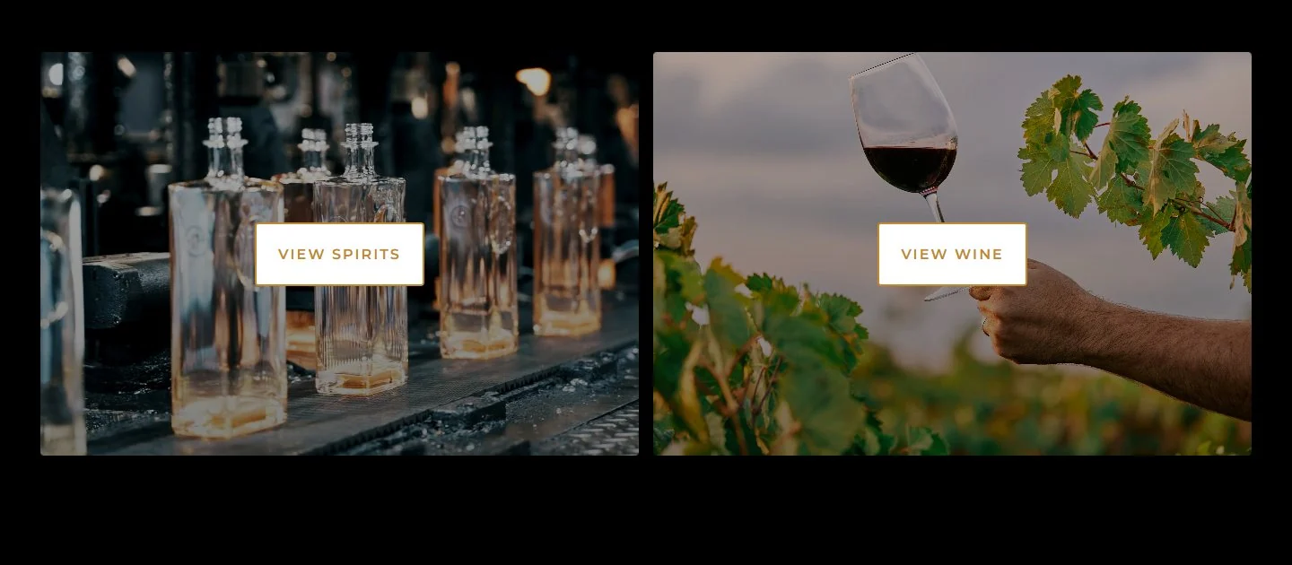
    Original category tiles for spirits and wine with no prices
    Two photo tiles and no prices
    After
    decant-it-wine
    Redesigned product carousel with bottle photos, names, prices and Add to Cart buttons
    Product cards with price and Add to Cart
    E

    Tell the story behind the bottle

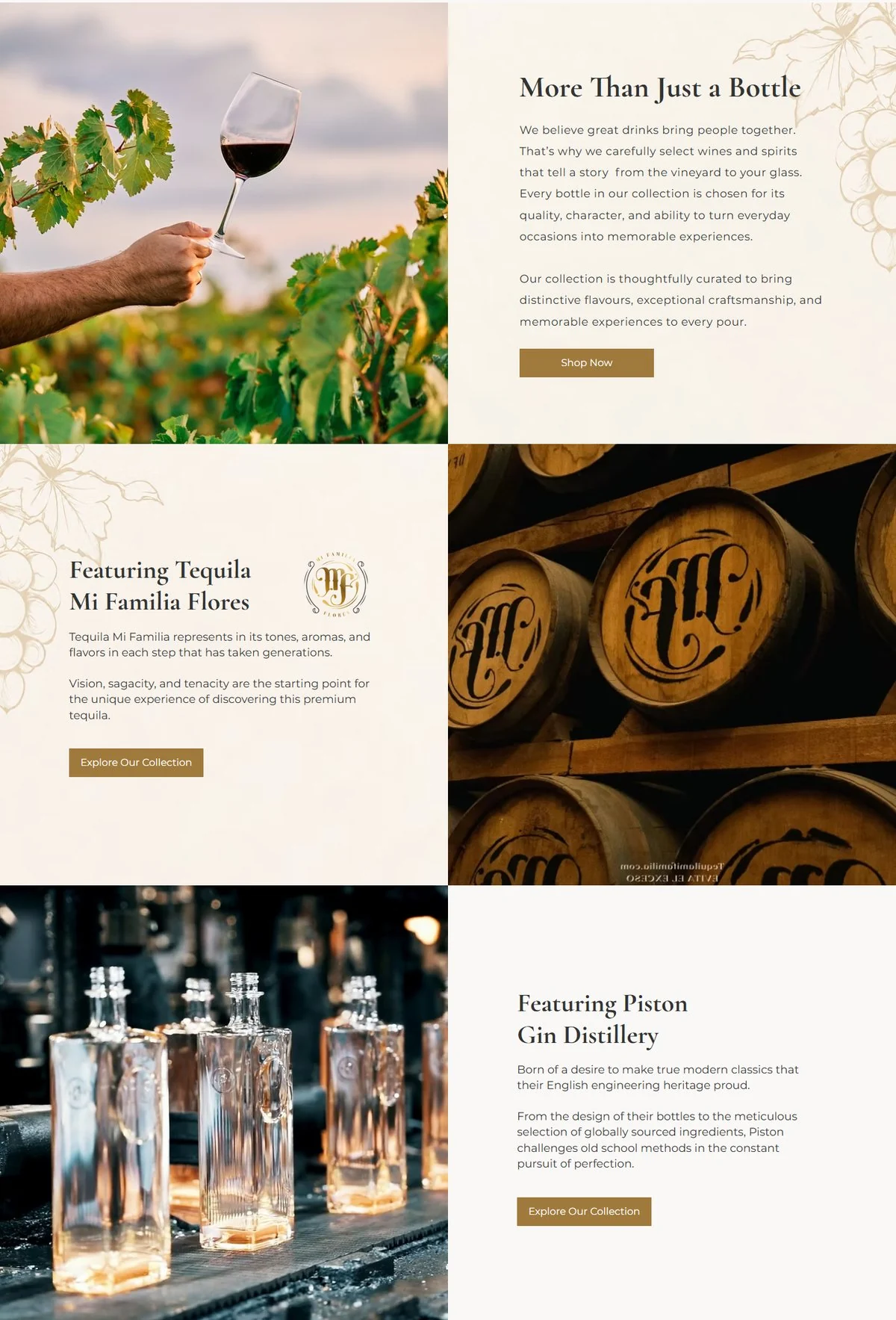
    New sections introduce the brands Decant-It imports, like Tequila Mi Familia Flores and Piston Gin, with photography and a short history. A reason to buy beyond the label. Solves 4.

    decant-it-wine
    Redesigned story sections: More Than Just a Bottle, Featuring Tequila Mi Familia Flores and Featuring Piston Gin Distillery
    F

    Events that sell themselves

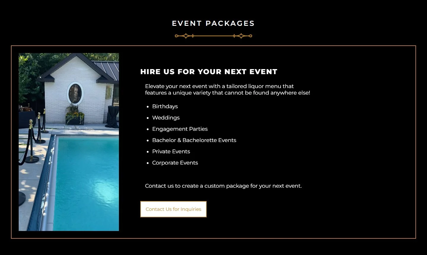
    Event packages were a list inside a gold border. The redesign gives them an inviting headline, soft photography and one Inquire Now button, so planning an event feels like a service, not a form. Solves 5.

    Before
    decant-it.com
    Original event packages section on black
    A bordered list on black
    After
    decant-it-wine
    Redesigned event packages section with serif headline and Inquire Now button
    A clear headline and one next step
    G

    Navigation built for buying

    The menu now leads with About and Shop, and adds a cart and account login in the header. Shoppers always know where their order is. Solves 2.

    BeforeSpiritsWineEventsContact
    AfterAboutShopGalleryContactCartLog in
  3. 03

    Development

    I built the new site on Wix, so Decant-It can update products, prices and stories on its own and sell through a built-in store with a cart and checkout. I set up every section for both desktop and mobile, since most people browse bottles on their phone.

    Mobile view

    Before
    Original Decant-It homepage on mobile
    Stacked bottles on black
    After
    Redesigned Decant-It homepage on mobile
    Warm, readable, shoppable

    Hover a phone to scroll the page

    Full homepage desktop view

    Before
    decant-it.com
    Full original Decant-It homepage
    After
    decant-it-wine
    Full redesigned Decant-It homepage

    Full homepages. Hover to scroll.

Results & Reflections

Decant-It now looks like the importer it is. Shoppers can see the price, read the story and buy in the same visit.

What worked

Letting the brand’s own world lead the design. Warm colours, a heritage logo and real brand stories make the store stand out from dark, generic liquor sites.

What I learned

A redesign is about removing friction as much as adding polish. Showing the price and the cart up front did more for the shopping experience than any visual effect.